Responsive design and mobile-first design are two distinct approaches to creating websites that perform well across devices. Here's the quick takeaway:
- Responsive design starts with a desktop layout and adjusts it for smaller screens using flexible grids, media queries, and scalable images. It's best for sites where desktop users dominate or when retrofitting an existing site.
- Mobile-first design begins with small screens in mind, focusing on speed, touch-friendly navigation, and essential content. Features are added progressively for larger devices. This approach aligns with the growing dominance of mobile traffic and Google's mobile-first indexing.
Quick Comparison
| Feature | Responsive Design | Mobile-First Design |
|---|---|---|
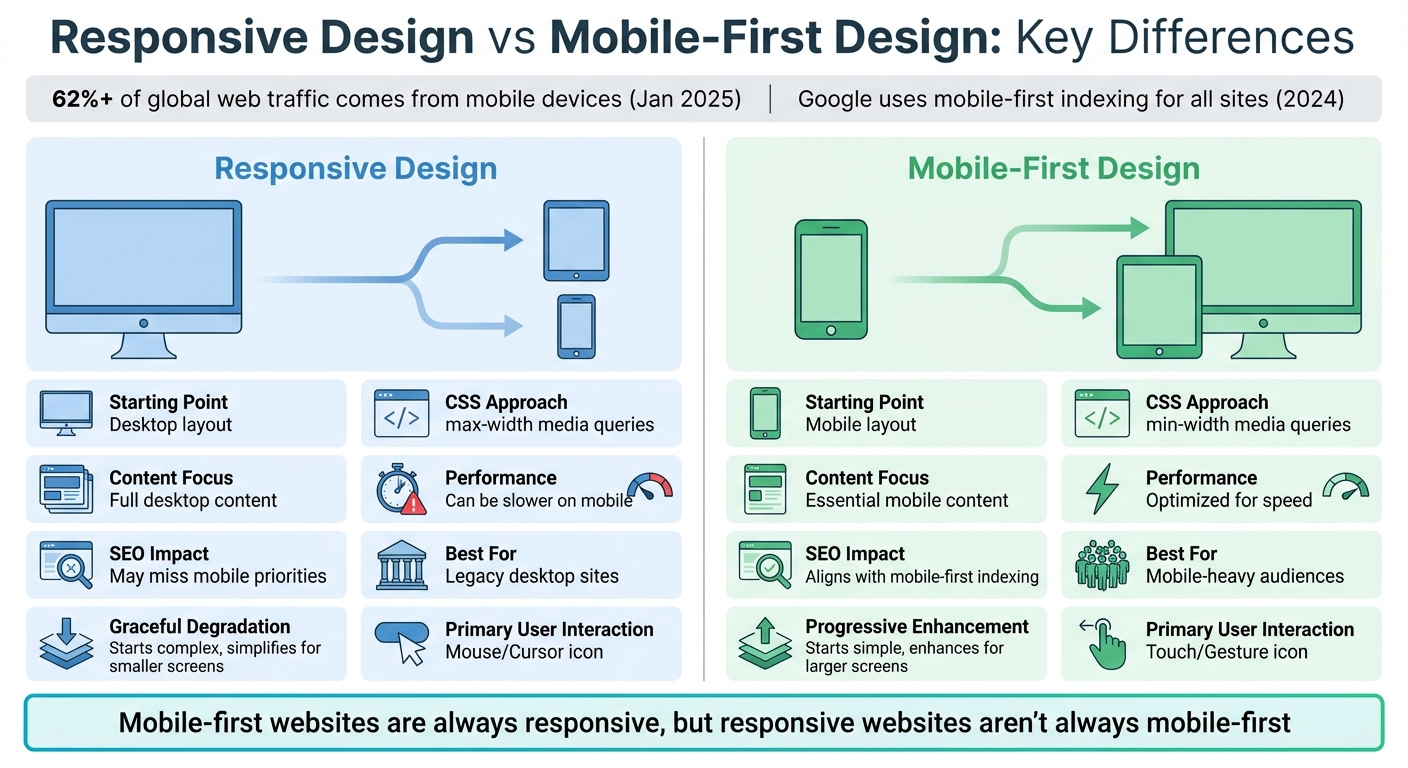
| Starting Point | Desktop layout | Mobile layout |
| CSS Approach | max-width media queries | min-width media queries |
| Content Focus | Full desktop content | Essential mobile content |
| Performance | Can be slower on mobile | Optimized for speed |
| SEO Impact | May miss mobile priorities | Aligns with mobile-first indexing |
| Best For | Legacy desktop sites | Mobile-heavy audiences |
Key Insight: If most of your traffic comes from mobile devices, mobile-first design is the better choice. However, for desktop-heavy platforms like admin dashboards, responsive design may be more practical. Both approaches aim to balance usability, performance, and SEO, but your audience's needs should guide your decision.
Responsive Design vs Mobile-First Design: Key Differences Comparison Chart
Mobile-first vs Responsive Web Design | DesignRush Quicksights Episode 1

What is Responsive Design?
Responsive Web Design (RWD) ensures that your website looks and functions well on any device, whether it's a desktop, tablet, or smartphone. It achieves this through a single codebase that uses flexible grids, media queries, and scalable images to adapt automatically to various screen sizes. Instead of creating separate versions of your site for each device, responsive design adjusts the layout dynamically based on the user's device.
At its core, RWD relies on three main techniques:
- Fluid grids: These use relative units like percentages, rems, or ems to resize elements proportionally.
- Media queries: These CSS filters apply different styles depending on conditions like screen width - for example, when the screen is narrower than 768 pixels.
- Flexible images: By setting a
max-width: 100%rule, images scale down to fit their containers without distorting or overflowing.
Another key element is the viewport meta tag (<meta name="viewport" content="width=device-width, initial-scale=1">). Without it, mobile browsers might render your page at desktop width, breaking media queries and forcing users to zoom in and out. Modern responsive design also incorporates CSS Flexbox and Grid to efficiently distribute space, replacing older methods like floats.
"Responsive web design is a design approach that addresses the full range of available devices and device sizes, enabling automatic adaption to the screen." – MDN Web Docs
Traditionally, designers used a desktop-first strategy, building a full-featured desktop site and then scaling it down for smaller screens. This made sense when desktops dominated web traffic, but now, with mobile devices accounting for over 62% of global webpage views as of January 2025, this approach shows its limitations. Issues like slow performance and poorly prioritized content have highlighted the need for a more mobile-focused approach.
Main Features of Responsive Design
One of the defining aspects of responsive design is its single codebase. Instead of maintaining separate mobile and desktop sites, you use one HTML structure and a unified set of CSS rules that adapt to different screen sizes. Media queries trigger layout changes at specific breakpoints, ensuring the design remains functional and visually appealing across devices.
Proportional scaling plays a big role, too. Instead of fixed pixel dimensions, elements are sized relative to the viewport. For instance, a sidebar might be defined as "25% of the viewport width" rather than a fixed "300 pixels wide." This allows elements to resize naturally as users rotate their phones or adjust browser windows.
Responsive design also emphasizes cross-device compatibility. Navigation menus might appear as a horizontal bar on desktops but collapse into a hamburger menu on mobile. Images resize to fit smaller screens without breaking the layout, and text reflows to remain readable without horizontal scrolling. Techniques like the srcset attribute further improve performance by serving images optimized for the user's device resolution, avoiding unnecessary downloads of large desktop images.
Benefits of Responsive Design
Responsive design is particularly appealing for businesses with existing desktop sites. It allows you to improve mobile compatibility by retrofitting media queries and flexible grids without starting from scratch. This approach is especially useful for Canadian companies with legacy websites.
With a single codebase, maintenance becomes much easier. Any updates - whether it's new content, branding changes, or bug fixes - apply across all devices automatically. For small business owners managing their own sites, this saves time and reduces technical headaches.
From an SEO standpoint, responsive design is highly effective because it uses a single URL for all devices. Google's crawlers can index your content more efficiently without dealing with separate mobile and desktop URLs. Plus, backlinks earned benefit the entire site, improving your overall search rankings.
Another advantage is the consistent brand experience it delivers. Whether users visit your site on an iPhone during their morning commute or on a desktop at work, they'll see the same cohesive design - logos, colours, typography, and layout remain consistent. This consistency helps build trust and recognition, which is crucial for businesses targeting both local and broader markets.
Challenges with Responsive Design
While responsive design has many strengths, it’s not without challenges. One major issue is performance. Scaling down a desktop layout often results in heavier downloads for mobile users. Even if the layout adjusts, mobile devices might still load large desktop-sized images, unnecessary JavaScript, or complex CSS. This can lead to slower load times, which is a serious problem - websites that load slowly can lose up to 50% of their visitors.
"Responsive design is like a shapeshifter. It crafts a big, detailed layout... then tweaks and blends it to suit smaller screens." – Design Studio UI/UX
Another challenge is content prioritization. A desktop-first approach often hides or removes features on mobile instead of thoughtfully optimizing them. This can result in a compromised mobile experience, where touch interactions are clunky, navigation requires multiple taps, or key actions are buried below the fold. For Canadian businesses, this reactive approach can mean missed opportunities to engage users and drive conversions effectively.
What is Mobile-First Design?
Mobile-first design flips the traditional desktop-first approach on its head. Instead of starting with a desktop layout and scaling down, this method begins with a design tailored for smartphones. Features are then added progressively for larger screens, ensuring the mobile experience is prioritized right from the start. Unlike responsive design, which adapts existing desktop layouts for smaller screens, mobile-first design builds everything from a mobile foundation. This makes sense in a world where smartphones drive a large share of web traffic.
"Designing for desktop first is outdated... mobile constraints - limited space, slower networks - act as catalysts for innovation." – Luke Wroblewski, Author of "Mobile First"
The core principles of mobile-first design revolve around content prioritization and touch-friendly interaction. With limited screen space, it’s crucial to focus on what matters most, eliminating unnecessary clutter. Instead of relying on cursors or hover effects, mobile-first design is built for fingers and thumbs. This means larger tap targets - 44×44 pixels as Apple recommends, or 48×48 pixels per Google’s guidelines - and navigation designed for swiping.
This approach has another advantage: better performance. Starting lean and building up reduces unnecessary bulk, which helps mobile-first designs load faster, even on slower networks. For Canadian businesses, especially those serving rural areas with less reliable connectivity, this can make a big difference. Optimized designs, with lightweight images (ideally under 500 KB), minimal scripts, and efficient code, keep things running smoothly.
Main Features of Mobile-First Design
Mobile-first design emphasizes simplicity and touch optimization. Navigation is streamlined, often limited to 5–9 menu items following Miller’s Law. To keep interfaces clean while still allowing deeper content access, designers often use options like hamburger or accordion menus.
Content hierarchy plays a key role since mobile users tend to scan rather than read. Clear headings, short paragraphs, and ample white space ensure the most important details are easy to find and appear "above the fold". Buttons and links are spaced far enough apart to avoid accidental taps, and touch gestures like swiping or pull-to-refresh add to the user-friendly experience.
Performance optimization is built into the process. Techniques like using modern image formats (WebP or AVIF) and the HTML "srcset" attribute allow browsers to load appropriately sized images for each device. This aligns with Google’s mobile-first indexing, which became fully implemented in 2023.
Benefits of Mobile-First Design
The biggest win is improved mobile performance. Designing with mobile limitations - like slower networks, smaller processors, and restricted bandwidth - means the result is fast and responsive. For Canadian businesses, particularly those catering to rural areas, this can enhance user retention.
"Mobile-first design is a speed demon by nature. It is lean and nimble, like a bike zipping through traffic." – Design Studio UI/UX
There are also SEO perks. Since Google now primarily evaluates the mobile version of websites for rankings, mobile-first design naturally supports better search visibility. Plus, with roughly 83% of social media activity happening on mobile devices, this approach strengthens social media marketing efforts.
Accessibility often improves as well. High-contrast colours, readable fonts (minimum 16 pixels for body text), and simple navigation benefit everyone, including those with visual impairments or cognitive challenges. By focusing on essentials, businesses often see better conversion rates and happier users.
Challenges with Mobile-First Design
Adopting mobile-first design isn’t without its hurdles. The shift from a desktop-first mindset requires rethinking everything from the ground up - information architecture, feature prioritization, and more. This learning curve can slow down initial projects. Scaling a mobile design for desktop use can also be tricky. If not handled well, the desktop version may feel like an oversized mobile site, lacking optimization.
There’s also the matter of cost. For businesses with existing desktop sites, starting over with a mobile-first approach can be expensive. Testing adds another layer of complexity. Unlike desktop browsers, which are relatively uniform, mobile devices vary widely in screen sizes, operating systems, and capabilities. Real-device testing is crucial to catch issues that emulators might miss.
These challenges highlight the complexities of mobile-first design and how it shapes both user experience and SEO outcomes.
How Responsive and Mobile-First Design Differ
Responsive design and mobile-first design both aim to create websites that function well across devices, but they approach this goal in completely different ways. Responsive design adapts a full desktop layout to fit smaller screens, while mobile-first design starts with a minimal mobile layout and builds upward for larger devices.
The technical details highlight this difference. Responsive design typically uses max-width media queries in CSS to adjust styles as screen sizes shrink. In contrast, mobile-first design employs min-width media queries, adding styles and features as the screen size grows . This approach often results in cleaner and more efficient code, as mobile-first development starts with a lean foundation instead of stripping away elements from a complex desktop layout.
Design Principles Comparison
The philosophies behind these approaches influence everything from content priorities to performance. Responsive design uses a "graceful degradation" approach, starting with a feature-rich desktop version and then simplifying it for smaller screens. Mobile-first design, on the other hand, uses "progressive enhancement", beginning with a functional core for mobile and adding features for larger devices.
| Feature | Responsive Design (Desktop-First) | Mobile-First Design |
|---|---|---|
| Primary Principle | Graceful Degradation | Progressive Enhancement |
| Starting Point | Desktop / Large Screen | Mobile / Smallest Screen |
| CSS Technique | Max-width media queries | Min-width media queries |
| Content Strategy | Adapting/squeezing all content | Prioritizing essential content |
| User Interaction | Mouse-over / Cursors | Touch / Gestures |
| Performance | Can be heavy due to "leftover" code | Lean and optimized for speed |
This isn't just theory - it has real-world consequences. Google’s Daniel Ahn notes that if a page takes more than 3 seconds to load, the likelihood of a user leaving increases by 32%. If it takes over 5 seconds, that number jumps to 90%. Amazon discovered that every 100 milliseconds of additional load time reduces sales by 1%. Mobile-first design tackles these challenges by treating mobile constraints as opportunities to streamline and innovate.
Implementation Methods
The coding process for these approaches is another area where they differ. Responsive design often requires overriding styles - like switching from display: flex to display: block - to make desktop layouts work on mobile. This can lead to bloated CSS. Mobile-first design, however, builds layouts incrementally, adding only what’s necessary as screen sizes increase.
Navigation design also highlights the contrast. Responsive sites frequently need to simplify complex desktop navigation menus for mobile, which can feel clunky. Mobile-first sites, by contrast, are designed with mobile navigation in mind from the start, using touch-friendly elements like hamburger menus and larger tap targets (44×44 pixels per Apple’s guidelines or 48×48 pixels per Google’s) .
These differences in coding and navigation design directly impact how users experience each approach.
User Experience Differences
User experience is a key area where these methods diverge. Responsive design aims to maintain content parity, rearranging all desktop content for mobile screens. However, this can sometimes result in unoptimized elements that slow down performance. Mobile-first design forces teams to focus on what’s most important, placing key information above the fold and eliminating unnecessary clutter .
Performance is another critical distinction. Mobile-first websites are built to be lightweight, with optimized images, minimal scripts, and smaller file sizes. In contrast, responsive sites can inadvertently deliver desktop-sized assets to mobile users, slowing load times . For Canadian businesses, especially those serving rural areas with less reliable internet, this performance gap can be a dealbreaker, potentially losing up to 50% of visitors .
"A mobile-first website is always responsive, but a responsive website isn't always mobile-first." – Leah Mangold, Content Specialist at Finalsite
The differences in performance and user engagement underscore the importance of choosing the right design strategy, as these decisions can significantly impact SEO and conversion rates.
sbb-itb-d0c5e4d
SEO and Search Rankings Impact
Your website's design has a direct effect on how Google ranks it. Since Google completed its mobile-first indexing rollout in 2024, all websites are now assessed based on their mobile version. As previously discussed, design decisions influence how content is delivered, which in turn impacts SEO metrics.
Mobile-First Indexing Benefits
Google primarily evaluates your site based on its mobile version, meaning any missing content on mobile will negatively affect rankings for both mobile and desktop searches. A mobile-first design ensures that content is consistent across devices. On the other hand, responsive designs created with a desktop-first approach often hide or remove elements on mobile, which can hurt rankings.
This shift aligns with user behaviour - over 60% of global web traffic now comes from mobile devices, and 76% of mobile searches lead to a physical store visit within 24 hours. For Canadian businesses catering to customers across provinces with varying internet speeds, mobile performance is critical. Tools like Google Search Console's URL Inspection feature can help ensure that Googlebot sees the same essential content and structured data on both mobile and desktop versions.
Core Web Vitals Performance
User experience metrics, tracked by Core Web Vitals, further highlight the importance of design. These metrics focus on loading speed (Largest Contentful Paint or LCP), interactivity (Interaction to Next Paint or INP), and visual stability (Cumulative Layout Shift or CLS). Mobile-first designs, built with lean content and modern image formats, typically achieve an LCP below 2.5 seconds, meeting Google's "Good" standard.
Responsive designs focused on desktop-first often include unnecessary elements like heavy CSS or JavaScript, which mobile devices still need to process. This extra load can slow down page speeds and cause layout instability. Since 2026, INP has become the primary interactivity metric. Mobile-first designs tackle these challenges by delivering critical CSS inline and deferring non-essential scripts, ensuring smooth performance even on slower mobile processors.
| Core Web Vital | Focus Area | Mobile "Good" Threshold |
|---|---|---|
| LCP | Loading (Largest Contentful Paint) | < 2.5 seconds |
| INP | Interactivity (Interaction to Next Paint) | < 200 ms |
| CLS | Visual Stability (Cumulative Layout Shift) | < 0.1 |
Long-Term SEO Effects
Consistent performance improvements lead to better SEO over time. Mobile-first designs enhance the metrics that Google prioritizes, resulting in stronger rankings. Sites that load quickly and offer smooth interactions tend to have lower bounce rates and longer dwell times - key indicators of quality for search engines.
"Mobile-first indexing is no longer a transition - it is the permanent reality of how Google crawls and ranks the web." – Digital Applied
Additionally, mobile-first designs are better positioned for future technologies like voice search, AI-driven personalisation, and foldable devices. Developers are also adopting performance budgets - for example, limiting JavaScript to under 170 KB - to keep sites lightweight and competitive. For Canadian businesses aiming to reach both urban and rural audiences with varying connectivity, prioritizing mobile performance is essential to attracting and retaining visitors.
Choosing the Right Design Approach
What to Consider
When it comes to driving performance and user engagement, your design approach plays a critical role. Deciding between responsive design and mobile-first design depends largely on your audience and how they interact with your site. A quick look at your Google Analytics under Platform/Device can reveal the device split of your users. If mobile users dominate, a mobile-first design is often the smarter choice.
The complexity of your content also matters. Mobile-first design is ideal for content-heavy sites like blogs, news platforms, and e-commerce stores, where users spend their time browsing and reading. On the other hand, platforms like B2B portals, CRM systems, or admin dashboards - where desktop users deal with complex workflows and data tables - are better suited to a responsive desktop-first design.
For sites relying on conversions, speed is non-negotiable. Mobile-first design encourages optimization from the get-go. Consider this: Amazon reports that every 100 milliseconds of load time costs them 1% in sales. For businesses catering to diverse regions across Canada, prioritizing mobile performance is essential.
Budget and maintenance also influence your decision. Both approaches use a single codebase, which is more cost-efficient than managing separate mobile and desktop sites. However, starting with a mobile-first design is often the more budget-friendly route if resources are tight. Retrofitting a desktop-first site to meet mobile-first standards later can be costly, requiring extensive CSS rewrites, image compression, and performance adjustments.
How Web3 Can Help
Once you've considered your design needs, Web3's Framework can help you implement the right strategy. To address the demand for mobile performance, Web3 integrates features like performance budgets, modern image formats (WebP and AVIF), and critical CSS delivery. These tools ensure your site meets Google's "Good" thresholds for LCP, INP, and CLS.
For Canadian businesses, Web3 offers tailored solutions such as device traffic audits and mobile UX assessments. Their package, starting at $3,000, includes real-device testing that accounts for Canadian network speeds and hardware preferences. This ensures your site aligns with both design and SEO goals.
Whether you're launching a new e-commerce site that thrives on mobile-first performance or updating a B2B platform that benefits from responsive design, Web3's services go beyond design. Their integrated SEO tools and Google Ads management ensure your site is optimized for visibility and engagement across all devices.
Conclusion
Choosing between responsive and mobile-first design is a decision that significantly impacts user experience, site performance, and SEO outcomes. As discussed earlier, the two approaches differ in their starting points: mobile-first design begins with smaller screens using progressive enhancement, while responsive design adjusts a desktop layout through graceful degradation.
Your decision should align with user behaviour. If more than half of your traffic comes from mobile devices, mobile-first design is likely the better option. On the other hand, for platforms where desktop usage dominates - like B2B portals or data-heavy dashboards - a responsive design may be more practical. Regardless of the approach, prioritizing speed is essential, as slow-loading websites can quickly drive users away.
To make the most of your chosen strategy, effective implementation is crucial. Aligning your design with performance best practices ensures your site delivers a seamless experience. Tools like Web3's Framework offer practical solutions, including performance budgets, modern image formats, and critical CSS delivery, to meet Google's Core Web Vitals standards. By combining design expertise with SEO optimization and Google Ads management, Web3 provides a comprehensive approach that supports consistent online visibility and engagement across devices - an essential advantage for Canadian businesses navigating unique local conditions and user preferences.
The design choices you make today will shape your online success tomorrow.
FAQs
Can a site be both responsive and mobile-first?
Yes, a website can absolutely be both responsive and mobile-first, and the two approaches often complement each other. A responsive design ensures that layouts adjust smoothly to various screen sizes, while a mobile-first design focuses on optimizing the experience for mobile devices first, then scaling up for larger screens like tablets and desktops. Together, these strategies create a smooth, user-friendly experience across all devices, with mobile usability as the starting point and flexibility for other devices maintained.
What breakpoints should I use for mobile-first vs responsive CSS?
When designing with a mobile-first approach, begin with smaller screens - think 576px or less. Then, introduce breakpoints as the screen size increases, like 768px for tablets or 992px for desktops. This method ensures your design adapts seamlessly to larger viewports. Use min-width media queries to progressively adjust and improve layouts as the screen size grows.
Responsive design typically relies on fluid layouts, allowing elements to scale naturally. However, incorporating breakpoints is essential when the layout starts looking less effective or to address specific design requirements and common device dimensions.
How can I determine which approach suits my audience data?
To make informed design choices, start by analysing your website traffic and user behaviour. If the majority of your visitors are on mobile devices - a common trend in mobile-centric markets like Canada - then a mobile-first design might be the best fit. This approach focuses on delivering a smooth and intuitive experience specifically for mobile users.
However, if your audience is split more evenly between desktop and mobile users, a responsive design is a smarter choice. This ensures your site looks and works seamlessly across all devices, whether it's a smartphone, tablet, or desktop.
Dive into your analytics to uncover which devices dominate your traffic and how users are engaging with your site. These insights will help you decide the ideal design strategy for your audience.
